

ChartMagic
ChartMagic turns data from CSV, Excel, or Google Sheets into clear charts, automatically picking the right visualization type.

Overview
ChartMagic is a specialized AI tool designed for automatic visualization of tabular data. The service's main goal is to eliminate the need for users to manually choose a chart type and customize its appearance. When data is uploaded, the neural network analyzes its structure, identifies relationships between metrics, and independently selects the most suitable display format.
Instead of spending time experimenting with settings in spreadsheet editors, users simply upload a data file, and the algorithm suggests a ready-made solution — a bar, line, or pie chart. This approach is especially useful when you need to quickly prepare visual material for a report or presentation without diving into design details.
Automatic Data Analysis
ChartMagic's key feature is that the tool doesn't just build a chart — it first interprets the content of the uploaded dataset. The algorithm evaluates data types in columns, the volume of values, and the goals of potential visualization, then suggests the optimal display option.
Formats and Compatibility
The service accepts data in several common formats — CSV, Excel, Google Sheets — and also supports direct table copying. This compatibility makes the tool convenient for integration into existing workflows where data is already accumulated in familiar spreadsheet editors.
ChartMagic Characteristics
| Characteristic | Value |
|---|---|
| Type | AI tool for data visualization |
| Category | Charts and diagrams, Formulas and Excel, Marketing analytics |
| Input data | CSV, Excel, Google Sheets, pasted table |
| Website | chartmagic.ai |
| Publication date | May 1, 2026 |
| Distribution model | Not specified |
Who Is ChartMagic For?
Analysts and Marketers
ChartMagic is aimed at professionals who regularly work with numbers and need to present results in a visual form. Users preparing weekly reports, tracking marketing metrics, or analyzing sales dynamics will be able to reduce time spent on chart preparation and focus on data interpretation.
Managers and Presentation Teams
For those creating presentations and reporting materials, the service simplifies the process of visualizing key metrics. Instead of lengthy manual formatting, you just upload a table — and get a ready-made chart that can be embedded in a slide.
Students and Educators
Academic projects, coursework, and research assignments often require clear presentation of statistical data. ChartMagic suits educational purposes as it allows quick creation of neat charts without needing to master complex visualization tools.
How to Use ChartMagic?
Uploading Data
The workflow starts with uploading the source dataset. Users can choose one of three methods: upload a CSV or Excel file, connect data from Google Sheets, or simply paste a table directly into the service interface.
Automatic Visualization Selection
Once data is uploaded, the algorithm analyzes the table structure and determines the optimal chart type. Based on the results, ChartMagic builds the visualization without user involvement, eliminating the need to choose between bar, line, or pie charts manually.
Working with the Ready Chart
After the visualization is built, users have two main paths forward. You can export the chart in the desired format for use in documents, or embed it directly into reports or presentation materials via code or a dedicated link.
Key Features of ChartMagic
Selecting the Optimal Chart Type
Instead of manually trying different chart types, users trust the algorithm with the choice. Based on data structure and content, ChartMagic suggests the most relevant display method: a bar chart for comparing categories, a line chart for showing trends, or a pie chart for displaying proportions.
Working with Various Data Sources
The tool supports flexible data input methods. In addition to standard CSV and Excel formats, the service integrates with Google Sheets and allows pasting tables via the clipboard, speeding up data transfer from other applications.
Quick Visualization Creation
One of the service's key purposes is saving time on manual chart formatting. Users avoid lengthy operations of configuring axes, legends, and color schemes, getting a ready-to-use chart immediately after data analysis.
ChartMagic Advantages
Time Savings
The main benefit of the tool is reducing time spent on choosing a visualization type and formatting the chart. Where it used to take minutes or even hours, now you just upload data and get the result.
Simplified Metric Comparison
ChartMagic makes it easier to compare multiple metrics within a single table. The algorithm quickly builds visual series, allowing you to clearly see the relationships and dynamics of various parameters without manual setup.
Ready for Use in Reports
Preparing slides and reporting documents no longer has to be a labor-intensive process. The resulting charts can be exported or embedded into final materials right away, which is especially important under tight deadlines.
ChartMagic Disadvantages
Available sources do not mention any limitations, drawbacks, or weaknesses of the ChartMagic service. There is no information about possible limits on uploaded data volume, processing speed for large tables, or restrictions of the free plan. There is also no data on user support quality or offline availability. To objectively assess the tool's downsides, further testing on real tasks is required.
What Problems Does ChartMagic Solve?
Choosing the Right Chart Type
The tool addresses the need of users who are unsure which visualization type best fits a particular dataset. The algorithm takes on the role of an expert in selecting the display format.
Speed of Visualization Creation
The service solves the problem of quickly obtaining a clear chart without needing design skills or deep knowledge of data visualization. This makes the tool accessible to a wide audience.
Preparing Materials for Reports and Presentations
ChartMagic suits everyday tasks related to formatting final documents. One of the key use cases is preparing charts for corporate reports, academic projects, and presentations.
Comparing Multiple Metrics
The service helps quickly compare data from a single table by visualizing several metrics at once. This simplifies analyzing relationships between parameters and identifying patterns in the numbers.
ChartMagic Pricing
The provided source data contains no information about ChartMagic's pricing policy. It is unknown whether the tool offers a free plan, a trial period, or operates exclusively on a paid subscription. There is also no information about the cost of various service packages or the availability of corporate plans. To get up-to-date pricing information, you need to visit the service's official website or contact support.
ChartMagic Terms of Use
Information about ChartMagic's terms of use is absent from available sources. Requirements for uploaded data volume are not disclosed, and there is no data on privacy policy or how user files are processed. Restrictions on commercial use of charts created with the service are also unknown. It is recommended to review the service terms directly on the chartmagic.ai website before starting work.
ChartMagic Availability
The tool is available via a web interface at chartmagic.ai. The service's publication date is May 1, 2026. No information is provided about mobile apps, a desktop version, or offline mode. There is also no information about geographic access restrictions or support for various interface languages.
How ChartMagic Differs from Alternatives
The market offers a number of AI-powered chart creation tools. Among ChartMagic's known alternatives are Lucidchart AI, which offers broader functionality for creating diagrams and flowcharts, and ChatFlowchart, focused on building flowcharts from text descriptions.
ChartMagic's key difference from these tools is its narrow specialization in working with tabular data and automatically selecting the appropriate visualization type. While alternatives may require more user effort in configuring the final result, ChartMagic focuses specifically on the speed of converting tables into charts without manual setup. The service does not aim to create complex diagrams or process charts but concentrates on classifying and presenting numerical data from spreadsheets.
Conclusion
ChartMagic is a practical AI tool for quickly creating charts from tabular data. Its main value lies in automating the process of choosing a visualization type and reducing time spent on preparing visual materials for reports and presentations. The service supports popular data formats and can be useful for marketers, analysts, students, and anyone who regularly works with numerical information. The question of pricing and terms of use remains open, so before starting full-scale work, it is recommended to visit the tool's official website.
Frequently asked questions
See also
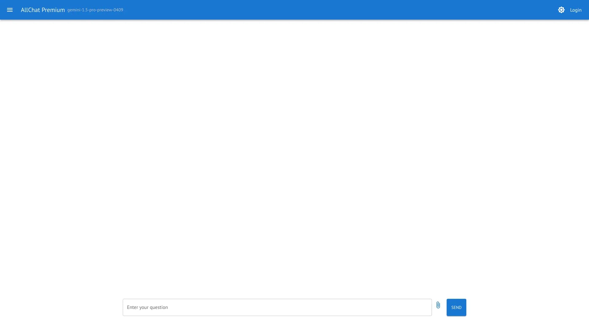
AllChat is a universal platform that combines several popular language models in a single interface for communication, image generation, file analysis, and code execution.


AI-based platform for creating logos and brand identity.

A platform for accountants that combines task management, file sharing, and client communication in a single interface.

Platform for generating videos, images, and digital avatars using AI.


Generative platform for creating realistic images and short videos from text or images with control over style and camera movement.
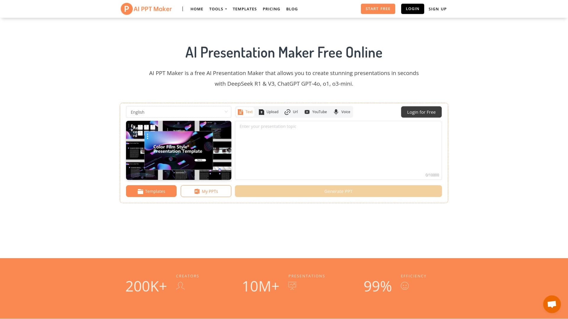

AI-powered online service for automatically creating presentations from text, PDF, audio, video, or URL links.
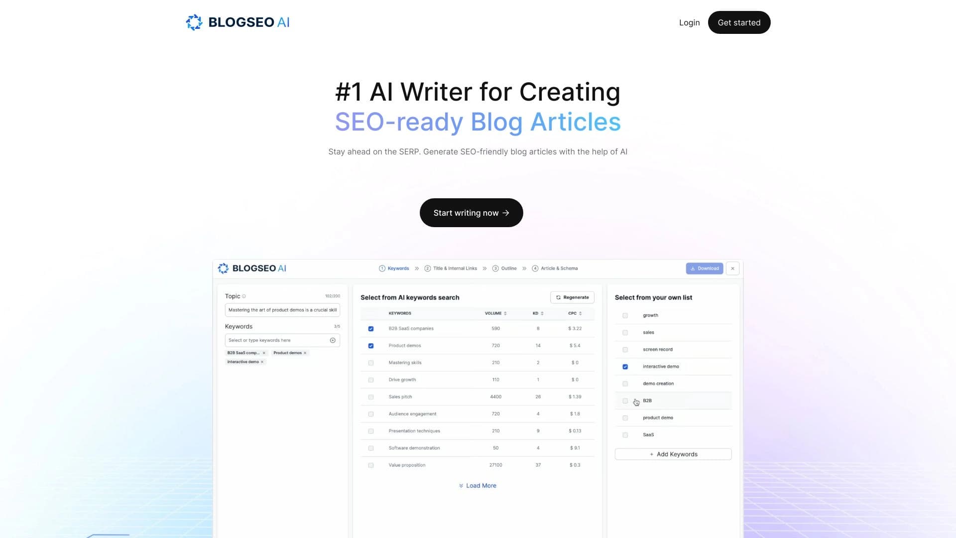

AI tool for creating SEO-optimized multilingual content.

Service for generating videos from text descriptions and images using modern neural networks.